
3D
Narrative
The decaying, crumbling remains of a ship after a fatal storm lay on the shore of an undiscovered island, among the looted valuables that it once carried across oceans.
Planning and Research


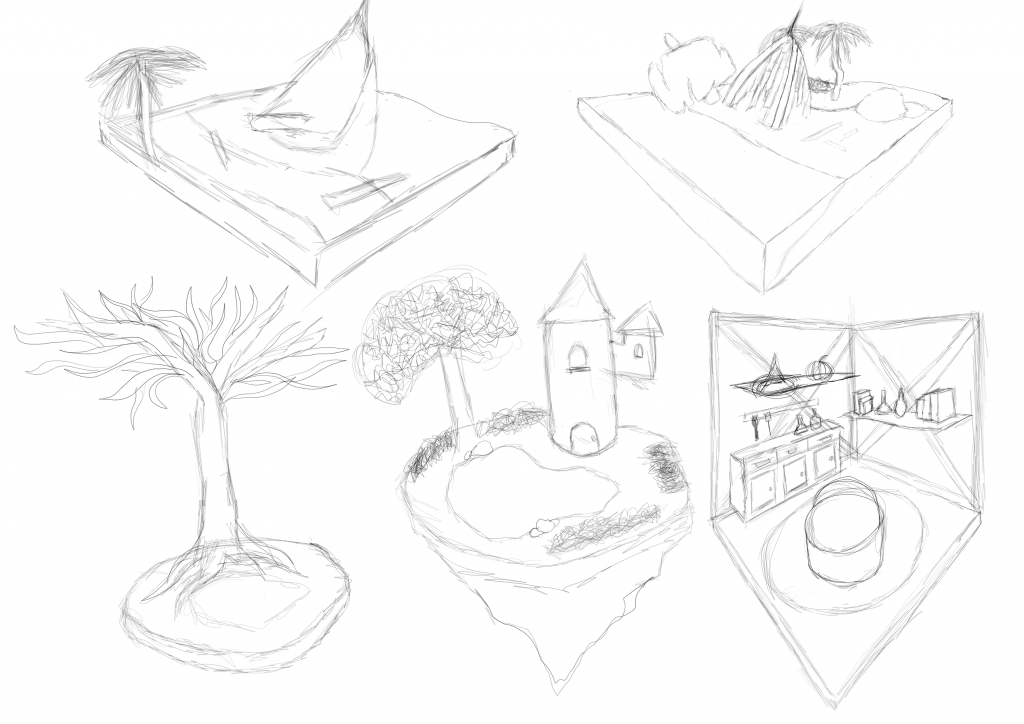
I started by sketching 5 diorama concepts, all with varying themes. The first concept I drew was a shipwreck in the ocean, near a beach. The second was also a shipwreck but actually on the beach. The third design was a simple diorama with focus on a large, Yggdrasil-style tree, the fourth was of a mystical wizard tower by a lake, and the fifth concept was of a witch’s cauldron room. I decided to choose the second concept, as it would keep the concept simple while also giving me a lot to do. It also was the concept that gave me the most inspiration and motivation. Being less experienced in 2D, it is and was not easy for me to accurately express the ideas that are in my head, but I was able to use perspectives and greyscales to bring out the very simple base form of what I am aiming to create.

I created moodboards to cement the style and features of my diorama. The first moodboard I made was of the game Sea of Thieves, as that is the style that I will be aiming to recreate. Since the hero asset of my diorama will be a shipwreck, I created a moodboard for them as well. However my ship will be much more simple, so I created a separate moodboard of simplified pirate ships. I also put together rough inspirations for the island, with bright, cartoony colours and assets I could use. I also created moodboards for the other assets in my diorama. I compiled renders of 3D stylised palm trees- I like how the leaves are made out of actual polygons and not reliant on a texture, and the trunk is simple but effective. I also compiled 3D stylised rocks, they’re simple and easy to create, and I can reference rock shapes using this moodboard. There will also be one or two treasure chests in the diorama, so I found pictures of cartoon-ish, stylised 3D treasure chests, because that is how I am aiming to make mine look. Lastly, I created a moodboard for the water, because I want it to be very simple, exactly like it is pictured in the references. Creating these moodboards helped me to solidify the diorama, how it will look and how all the assets will come together to create one final piece.
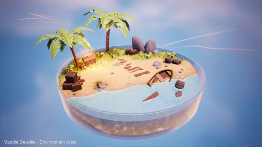
I found this diorama to act as my benchmark, as I feel it is the most similar to what I want to create. I like the stylised look, and how it does not feel overcrowded even with all the assets. I also want to take inspiration from how the grass transitions into the land, and how the assets tell a story. The lighting also makes the diorama look a lot more polished, with the treasure chest shining as if it has valuables insight. While the lighting refines the diorama, it is also worth noting that the textures are very simple, adding to the cartoon-ish style. Overall, the diorama captures the same atmosphere that I would like to create in mine.
Modelling

I started asset creation by creating the hero asset- the boat. I started with a cube and added edge loops so I could use the smooth select tool to move faces to create a slight curve, mimicking the curve of the body of a ship. I then deleted the back faces to open the back of the ship. I moved the edges and vertices to make it look more like the front of a ship, and then used the extrude tool to give it thickness, and to create a border on the top. I also used the extrude tool to create the bowsprit at the front of the ship. I used the multi-cut and the bridge tool to cut out ‘planks’ from the ship to make it look more wrecked, and then to make sure there were no N-gons I used the cleanup tool. I am very happy with how the boat turned out, however I think that using the cleanup tool was not the best thing I could have done, and that in the future I should be careful with the geometry of my meshes so that I do not have to rely on the cleanup tool.

I created a barrel next. I started with a cylinder and reduced the subdivision axis to 11, and then added edge loops to extrude the hoops. I extruded the bottom and top faces and made them smaller and moved them inwards slightly to give the barrel more detail, and then I UV mapped it. Keeping the barrel simple emphasises the low-poly style of the diorama, so I am satisfied with this.

Then, moving on to the palm tree, I created a cylinder and extruded in upwards and then added edge loops using the multi cut tool where I wanted the trunk to go outwards. Then, I bevelled the edge loops and moved the top edge of each bevel down and scaled them out slightly to create this effect of a palm tree. Then I bevelled the edge loops that I scaled outwards again so that they were not sharp edges. I created some low poly coconuts by creating a sphere and then reducing the subdivisions. I created the leaves by creating a plane and modelling it to the shape of a leaf, and then cut ‘cuts’ out in the leaf using the multi-cut tool. After making sure there were no n-gons, I extruded the faces to give it thickness, and then duplicated it around the top of the tree. I am very happy with how the tree turned out, but I think the way I duplicated the leaves was messy and left too much clipping where all the leaves meet. In the future, I should be careful of meshes cutting into each other especially as it can mess up the ambient occlusion.
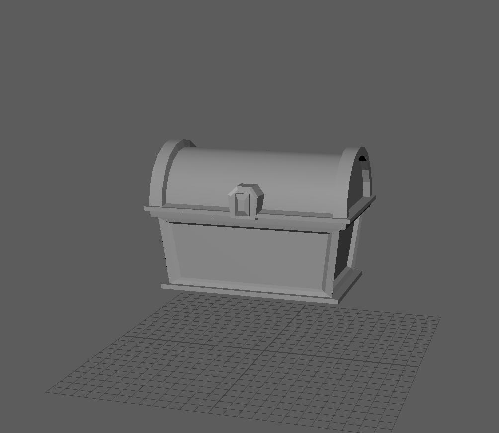
After I finished the palm tree, I decided to make a chest. I was unsure how to start so I researched some videos and demonstrations first. I started with a cube and a cylinder. I moved them to look like a chest by scaling the cube to be wider and deleting the bottom faces of the cylinder so that it was in the shape of a semi-cylinder. I moved the bottom edges of the cube inwards slightly, and then extruded the faces outwards and down to create the bottom part of the chest border. I extruded the top faces outwards and up for this same reason, and then I selected the 4 faces on the side of the cube and extruded them inwards to create a border of faces, and then I scaled the same selected faces inwards to give the border depth and connect it all. For the lid of the chest, I used the edge loop tool to cut where I wanted the border to ‘continue’, and then extruded the rest of the faces inwards. Then I modelled a gem by bevelling and scaling a cube, and created a holder for the gem by bevelling the top two edges of another cube, and put them on the lid. I am very happy with how the chest turned out, it is exactly like I pictured it, and I think it matches the style of the diorama very well.
Alan Balodi – 3D Tutorials (2022) YouTube. Available at: https://www.youtube.com/watch?v=OjWRTYs8DIU&t=1321s (Accessed: 30 October 2024).
3dEx (2020) YouTube. Available at: https://www.youtube.com/watch?v=3nnbaUYFaZ0&t=264s (Accessed: 30 October 2024).

I wanted to take a break from asset modelling so I moved onto terrain. My terrain is simple, it has three similar sections. The first section is the grass, which is the elevated section at the back. Then the middle section is dry sand, and then its the wet sand underwater. I created a cube and made it larger and flattened it, and then using the sculpting tools I created some varied, random terrain for the grassy section. I left the sandy section smooth, raising it where sand would gather, and then for the section where the water will be, I made the gradient of the sand decrease. For visual representation of the water, I created a cube and roughly sized it to the size of the terrain before giving it a new lambert material and decreasing the opacity. I am happy with the outcome, however I need to find a solution to creating the water still.

To create the bushes I used the platonic solid primitive to start with a geometrical style. I widened them, and then created some sticks out of cubes. I wanted to keep the bushes simple to emphasise the low poly style of the diorama.

To create planks, I created a cube and widened and flattened it, and then I moved the edges around to make it irregular. I kept these simple as they were just small decorations that will not be focused on.
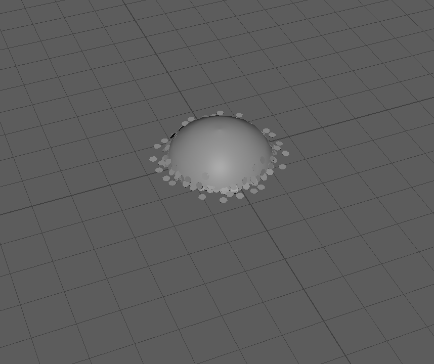
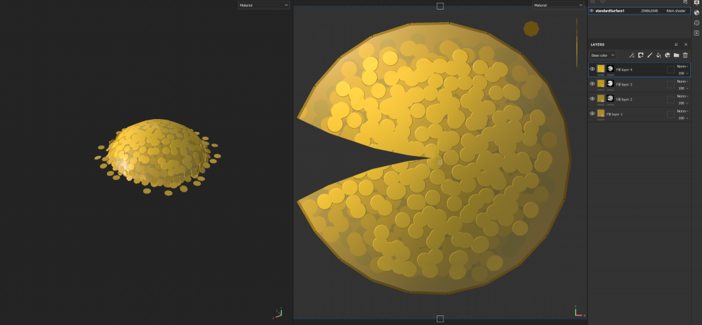
When making a pile of coins, its easy to get carried away with the polys. However, I decided that instead of modelling each individual coin, I could use a cylinder and make the top faces rounded to create a pile, and then add some small low poly coins surrounding it to make it actually look like a pile of coins. I would individually paint the coins on the pile when texturing. I could also add a bump map to make the coins seem like they are sticking out. I am proud of my quick creative thinking and I am happy with how the coin pile turned out.

Aside from coins, I wanted to also have gemstones lying around. I created these gemstones by bevelling cube edges to create clean cut geometric shapes that are commonly associated with gems, like the diamond shape in the middle. To create that, I bevelled all 4 vertical edges of a cube and then merged the bottom vertices to the centre. While I am happy with these gemstones, I think they are too simple and I could have created some more creative shapes. However, since they are only small decor that might not even be clearly seen, I decided to move on.

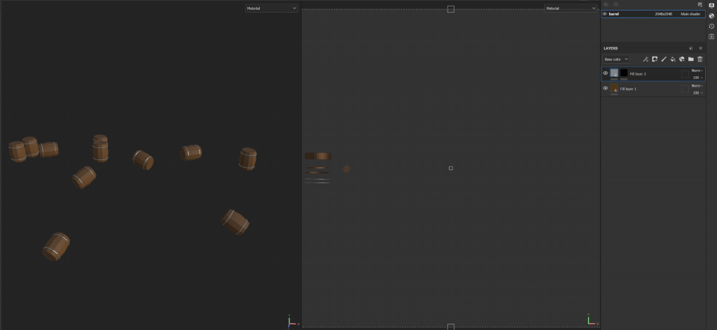
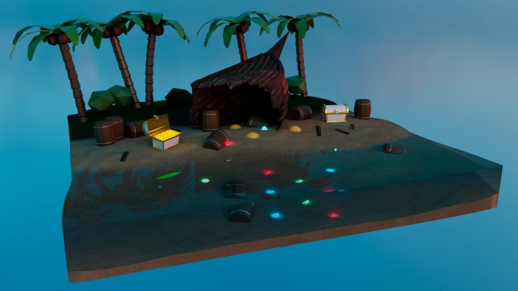
After I had finished modelling all my assets, I combined the all into one scene and created this diorama. I filled the space with barrels, gemstones and coins, and I added two chests as well, except one of the has an open lid and will have coins inside. To create these coins I just created a simple cube and added some subdivisions, and then raised some vertices to create some simple small level variation- as if I was sculpting manually. I will paint the coins onto this mesh like i will onto the coin pile. This also creates some continuation through the assets.

I asked peers and external people for feedback on my diorama and they suggested that I make the assets slightly bigger and to make the ship lay down as shown in the picture. This made the diorama look a lot more natural and put together, and so now I will move on to texturing. I am very happy with the diorama, I believe I have accurately shown my strengths in 3D modelling to put this together. However, there are still many things I need to learn and many ways where I could improve this diorama, such as adding more, better looking greenery.
Texturing
I started by texturing the barrels as they were simple. I created a fill layer and coloured it brown, and reduced the roughness to make it resemble wood. I then made the rings metallic and grey. Again, the barrels are simple to emphasise the low-poly look and so I am happy with them.

To texture the gemstones, I added an emissive map and coloured it red, green and blue for each gem. These gems will glow so I am not worried about detailing them.

For the palm trees, I made the bark brown with increased roughness, and made the coconuts darker, and coloured the leaves green. Having solid colours strengthens the low-poly style of the diorama, and leaves room for me to make the boat- the hero asset- more detailed.

I made the bushes a similar green to the tree leaves, with some slight variation between them.
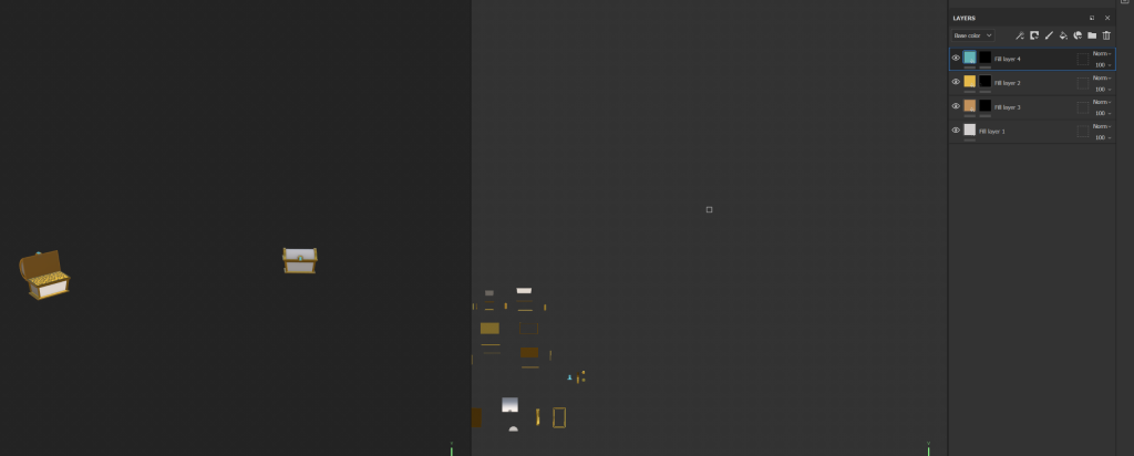
For the chests I made the border gold and the main body of the chest white, as I felt this makes it look more like treasure. On an emissive map, I made the gem bright light blue. I think this makes it stand out more and makes it clear that its valuable.
For the coin pile, I drew spots everywhere in three different shades of gold and gave the top layer a circle bump map and reduced the height slightly. Although I am happy with how this has turned out, I do think I could have drawn a more detailed coin just to elevate the diorama a bit more, but since the coins will not be focused on, I have decided to stick with this.
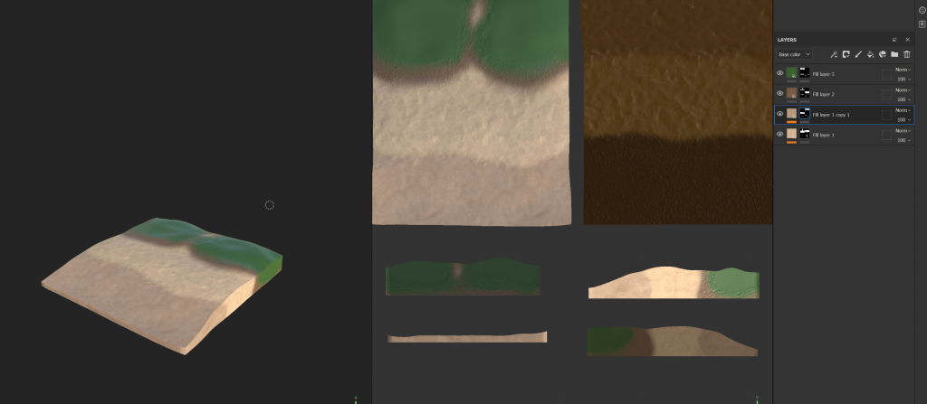
For the terrain I painted the sand first. I decided to use the material in substance because I thought that just making it one solid colour would be too simple. I added some dirt and then painted green on top of that for the grass section. Lastly, I made the sand that would be underwater darker so that it would look like wet sand. I am very happy with this, however I definitely need to learn more about terrain and texturing, as there are better ways to texture grass, and I do not know how I would go about adding that to a scene in Maya in the first place. Despite this, I am satisfied with the terrain.
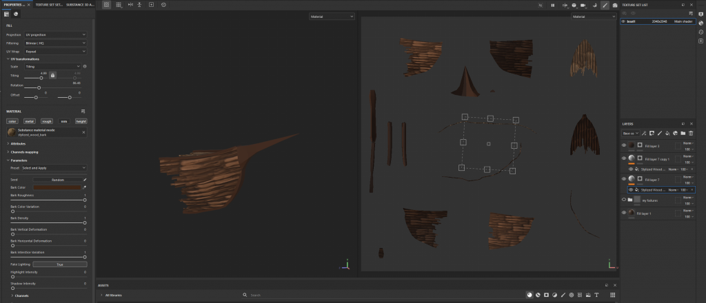
To make the boat, I started by handpainting wooden planks. However, this was not giving the desired effect, and it looked too simple and not at all how I wanted it to. I did not have time to restart handpainting and I was not sure I would be able to paint it well enough, so as a last resort I used the stylised wood material. I increased the tiling slightly so that the boat would look less realistic and then made the colour a rich brown. I significantly reduced the height amount so that it would look more stylised and less realistic. While I am not happy that I had to resort to using a material, I still think it turned out well. For the future, I will be developing my 2D skills so that I can confidently paint my textures.
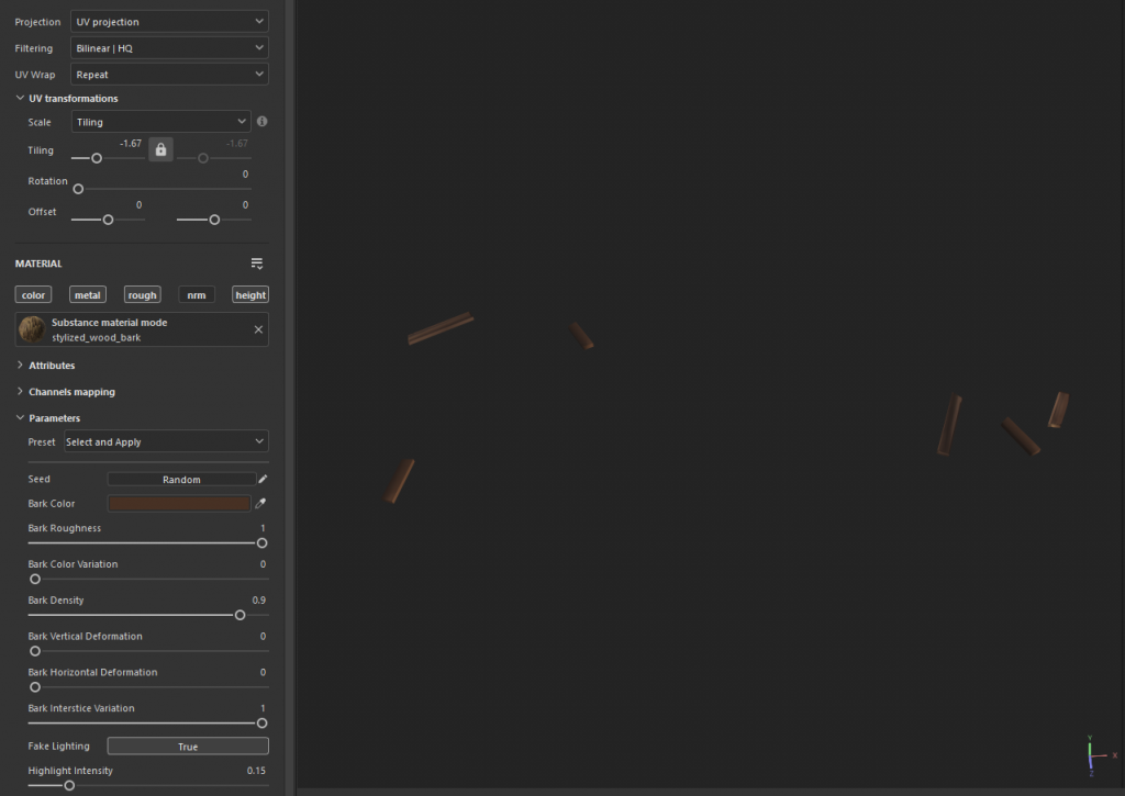
For the planks, I used the same material as the boat with the same settings, but I altered the colours a bit between them so that there was them variation. The planks are simple and easy to finish. Now I have textured everything that I needed to and I can move onto lighting and rendering in Maya.
Rendering

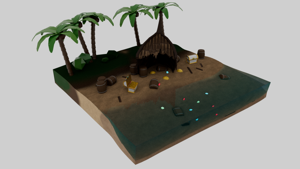
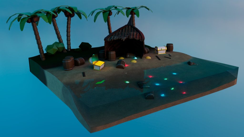
In Maya, I imported all the textures aside from the boat and planks as I have those files at home, and this is what it looks like so far. I made the water by creating a cube and moving the vertices on the edge to match the terrain, and then giving it an aiStandardSurface material and using the deep water preset. After making it blue, I got the desired effect. While I am happy with the diorama, I would have preferred to have some wave foam to the water to make it more stylised, but since I had limited time, I could not find any way to make the foam other than modelling it.
This is what it looked like once I added the boat textures.
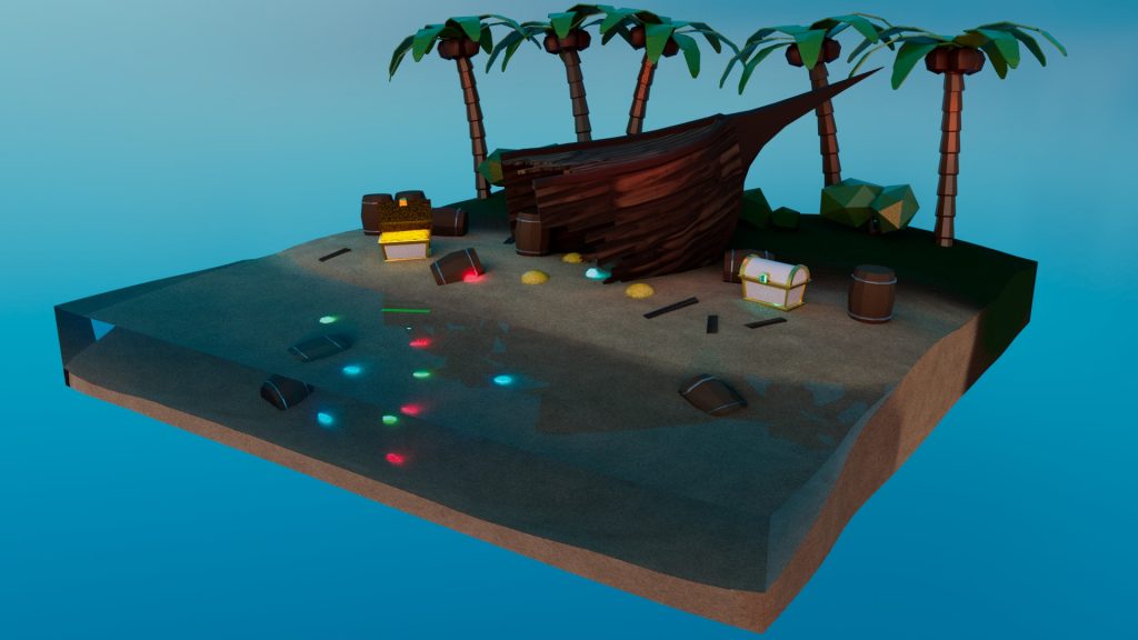
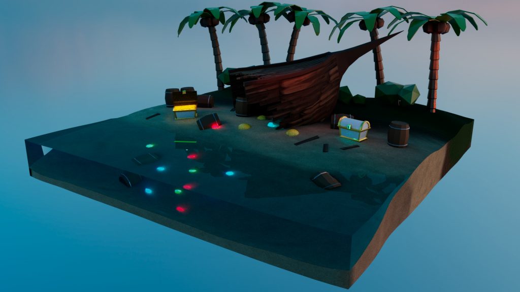
I thought the white skybox was too bland, so I found a rich blue HDRi map from HDRi haven and imported it into Maya. The lighting worked perfectly with the diorama. I added some mesh lights to the gems to make them glow, and I added an area light shining onto the coins in the chest to make it stand out as treasure. Lastly, I added some bright orange area lights shining onto the boats and the trees on the right to give an orange sunset glow effect. I took these four renders below, each with the skybox in a slightly different position to test which position gave the best lighting. I am very happy with how the renders turned out, but I do think that I have to practice lighting more because I could make this scene look much better if I had more knowledge on the best use of lights.
Reflection
Overall, in this assignment I have been able to recollect and refresh my 3D skills, while essentially doubling my knowledge and learning even more. While I knew the basics about modelling and texturing, I was able to learn more about specific settings, importing textures back into Maya, different lighting set ups, UVing and even mesh topology. While I learnt a lot through lectures, I was also able to do a lot of research and use external resources to find creative solutions and take inspiration from every corner of the internet. I am very satisfied with the outcome of the diorama, however I believe that there is still much more I could have done. I found myself taking shortcuts, like keeping the bushes as simple platonic solids instead of finding a different method to make them look much better, or with modelling the water and using an Arnold material preset rather than learning Unreal to be able to find a nice stylised water shade that I could use instead. I also ended up cutting the sail that I originally drew in the concept art as it felt like it distracted from the hero asset, but also because I could not think of a good way to incorporate it into the scene. In the future, if I were to do this project again, I would definitely find a way to improve the water, and I would try to make room for the sail, even if it was just the fabric hanging off of the boat. I would also work on the lighting more, adding more life to the scene. Hopefully by that point, I would be much more developed in my skills and I would be able to be even more efficient in my creative process. Despite all of this however, I am still very happy with the outcome of the diorama and think that it is a good representation of my current 3D skillset, and it was also a good way to learn more and improve in general.
2D
Planning and Research

I began this assignment by first creating my narrative. I definitely knew I wanted to do something surrounding nature and explored different natural environments like grassy fields and mountains, but I didn’t feel inspired and so instead I decided to explore what I could create out of the opposite- clouds, and a sky environment. After researching different environment concepts with clouds, such as futuristic cities and fantastical worlds, I came to the decision to make a cathedral in the clouds. However, I am going to experiment with the scene at both night and day, because I think it would suit both. I also want to add a magical element to it to elevate the fantastical theme.
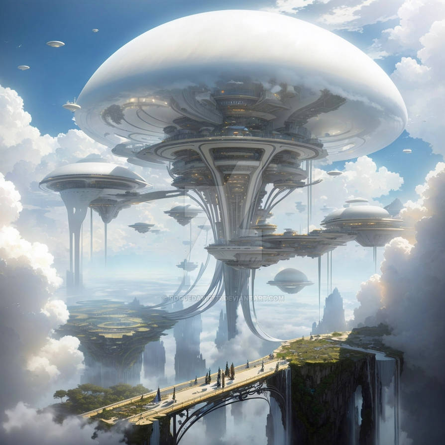
One of the futuristic city environments I explored. The reason I rejected this concept is because it feels too focused on buildings, while I want to focus on creating something fantastical out of clouds.
RogueDawg777 (2023) Cloud City.
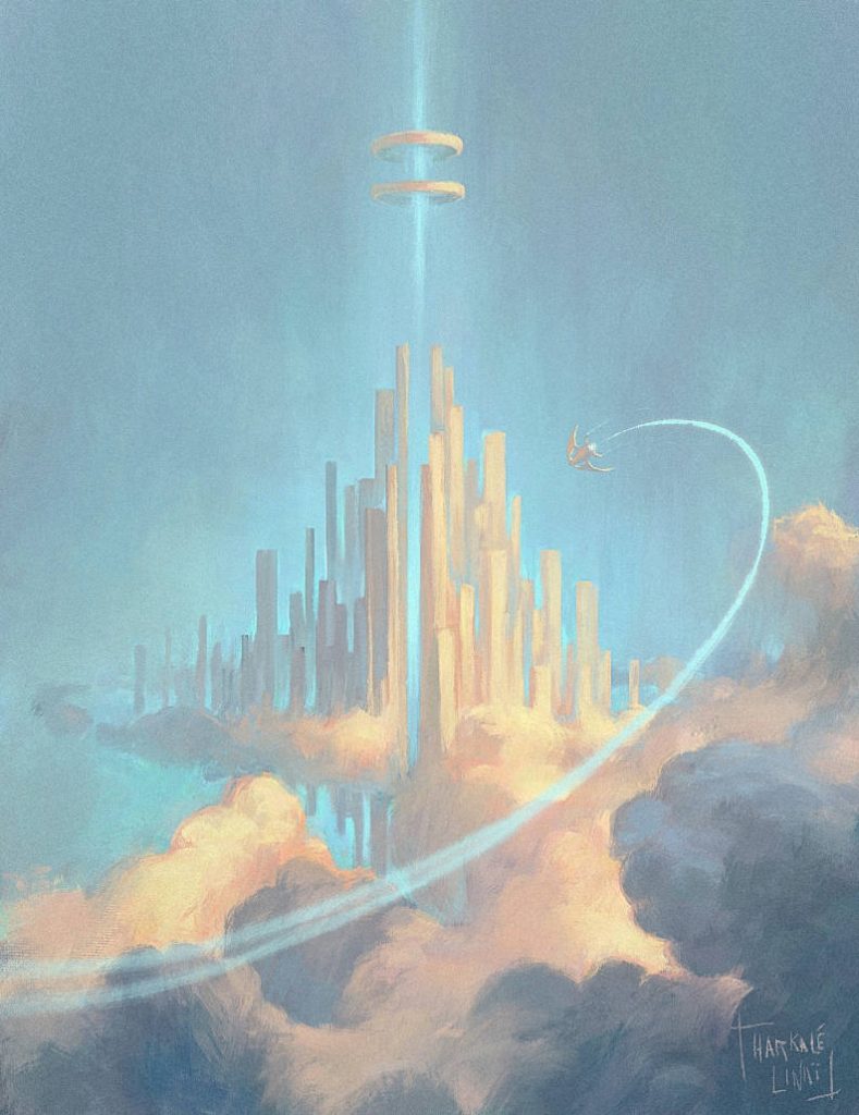
This artwork by Harkale-Linai is a great representation of the style and idea of the environment I want to create, however while this leans more towards a futuristic city, I would like to create a gothic cathedral from the Middle Ages.
Harkale-Linai (2018) Cloud City.

After experimenting with some thumbnails, I decided that I wanted to change my concept to something that inspired me more, which ended up being a greek temple residing above the clouds, and so I created a new mood board. I gathered references for the temple, clouds, the sun, colours, and the assets in the scene such as the fountain and the carpet. After making this mood board, I am feeling much more confident with my ability to pursue this idea.
Thumbnails
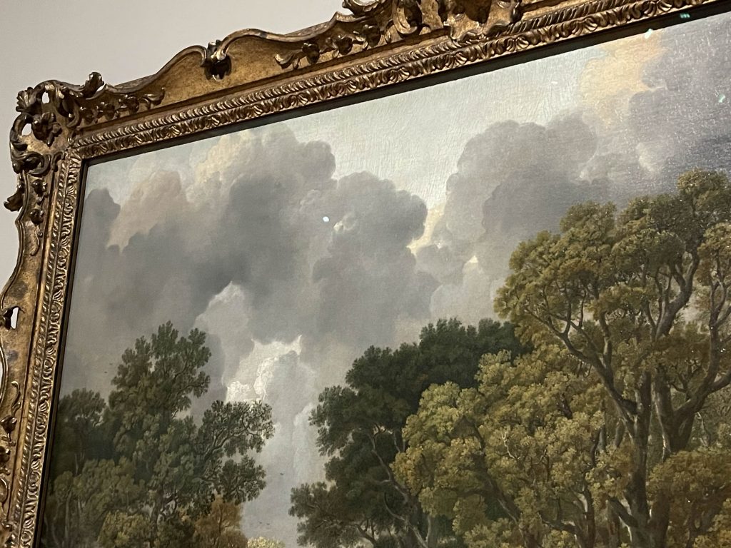


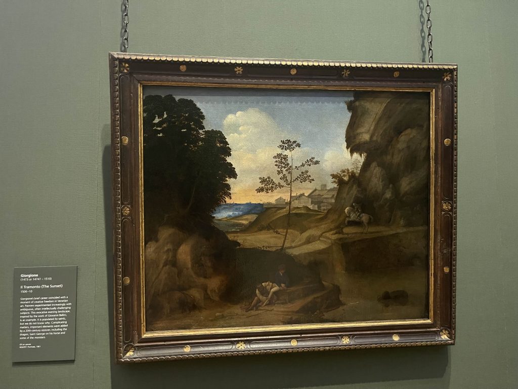
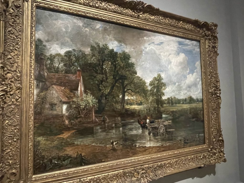

I visited the National Gallery to study the compositions of the paintings there and to really understand how a painting is formed. I used my sketchbook to outline and dictate different elements of each artwork, recognising where the foreground and the background split, and looking at the use of colours and saturation to help determine the perspective of the painting. This study was helpful to me for understanding how different compositions leads to different feelings and moods.
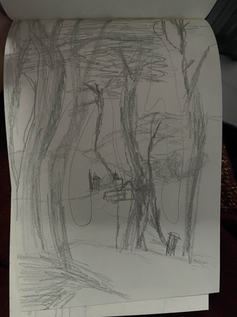
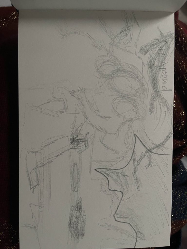
I began creating thumbnails to get my ideas down. While I was drawing, I realised that drawing a gothic cathedral may be too ambitious for me, especially since this is my first real work in 2D artwork and concept art. I was no longer feeling inspired by the idea I had created, but I still wanted to stick with the sky. Instead of a cathedral, I drew a castle instead and drew clouds around it. The scene felt empty however, so I decided to experiment with different ideas.

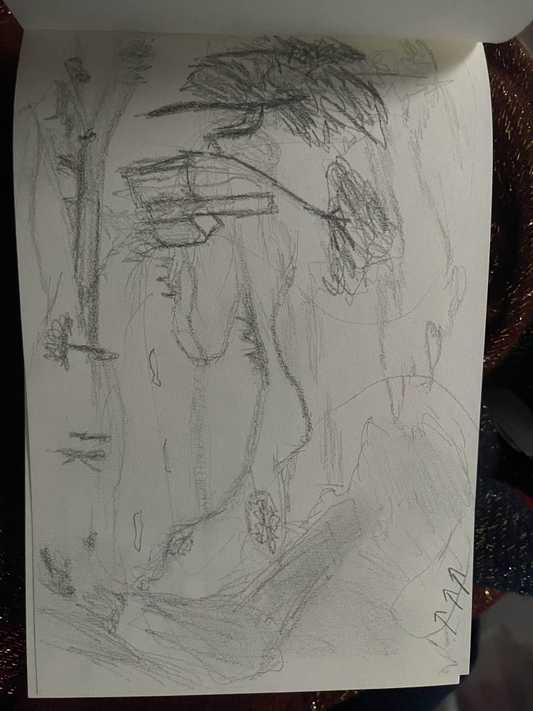
I experimented with creating a large hill with the sun behind it, and while I felt some inspiration from this, I thought it was too simple, and I could not think of more to decorate the image with. It was not making sense in my head, so I tried something else.

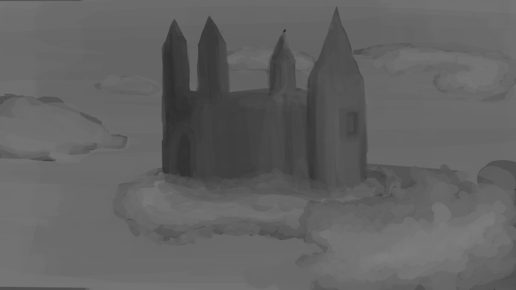
I wanted to stick with the sky environment, so I created a blanket of clouds covering the bottom of the sky, as if the painting is above the clouds. Then I decided to create a structure similar to greek architecture as the foreground. I added a sun behind the clouds, and drew a fountain in the structure. I feel inspired by this idea, and I am confident that this is something that I can build on, so I am going to be using this as my idea.
Studies
For skillbuilding purposes, I am doing some value, lighting, and perspective studies. I hope to improve my artistic ability so that I can confidently create my final concept art as well as I possibly can.
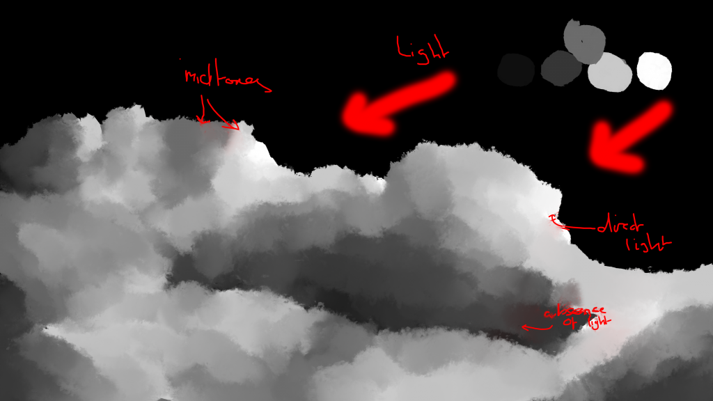
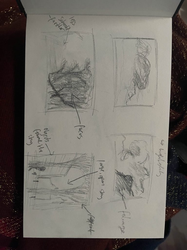
I did a value and lighting study on clouds. I started by going over an image of clouds I found, drawing blocks of colours using 4-5 different values to section off different portions of the clouds, going by how much light is hitting each section. I ended up with rough blocks of colour with no shape, so then using the mixer brush, and increasing the wetness scatter and the rotation scatter, I started mixing the blocks of colours together. By doing this, I was able to see how the midtones contribute to creating the shape of an object, defining the overall scene.


I did some rough perspective studies, using simple sketches to really understand how lines and shapes look when drawn in perspective. I tried one point all the way to four point perspectives by drawing simple shapes, and then sketched a very rough indoor one point perspective. I am unsure what perspective my final piece will be, but doing this study helped me to visualise and understand how different perspectives look
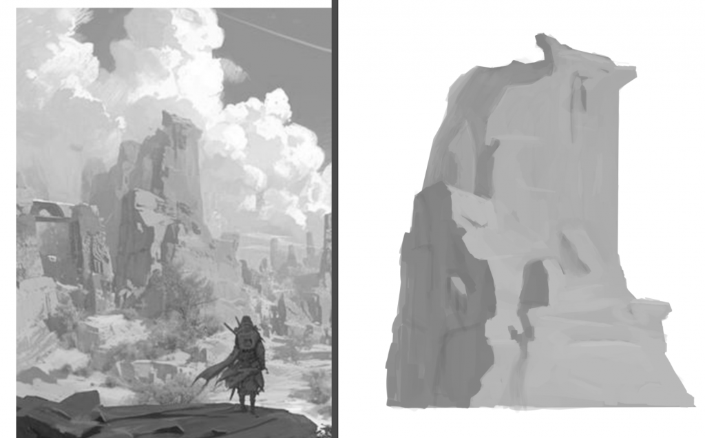
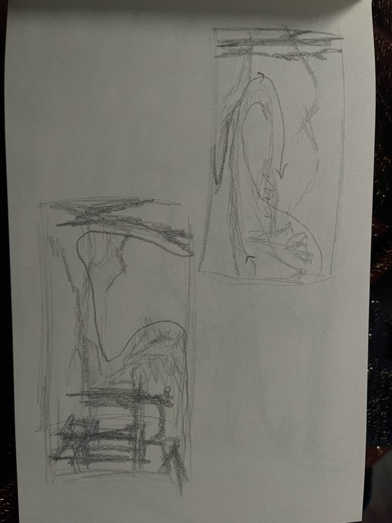
I did a lighting study taking reference from this rockface. I used a singular cube brush and started by creating the general shape of the object first, and then went in with darker and lighter values to outline the shapes and create shadows, focusing on defining the different faces of the rock.
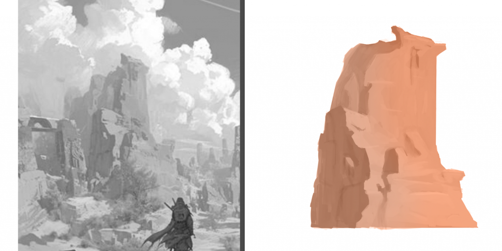
I wanted to colour the rockface in, so I created a new layer and changed the layer mode to colour, and then using a soft brush I coloured over the rock. This was my first time doing this, so it was extremely helpful to learn how to do this, because its a vital process to know when doing 2D artwork. I made the lighter parts of the rock more saturated to reflect that its facing the sun, and then in turn made the parts facing away from the light source less saturated.
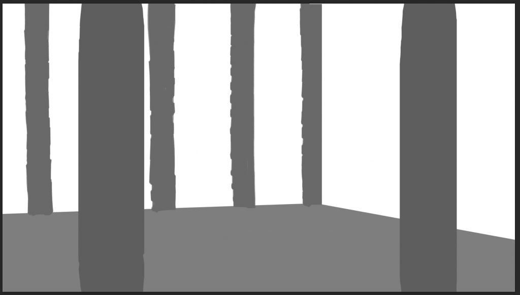
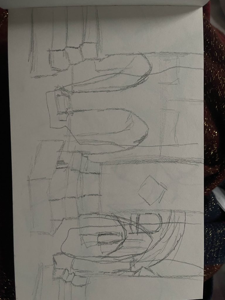
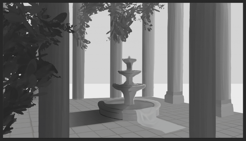
After doing some studies and testing out different thumbnails, I decided to start on my final piece. The foreground has two pillars, and the main focus is going to be the fountain in the centre. The background will be composed of clouds and the sky.
I blocked in archways on the pillars to make the scene look more like a courtyard and to fill in some of the empty space in the top third. I also added some plants to block in where they will be; I want plants and foliage hanging from the ceiling, and then at least one plant in the foreground. I photo-bashed the fountain into the centre of the scene so that I had a base to work off of, and I also made a basic block out of where the clouds and the sky will be.
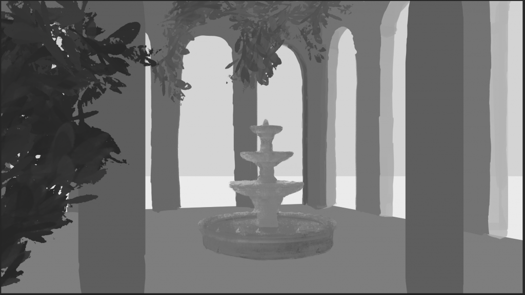
I added some marks to the pillars and chose a direction of light. Based on this, I started painting values onto the pillars and the fountain, as well as the shadows cast. I asked my peers for help with how the shadow would fall, and this aided me in understanding shadows and lighting, with cast shadows as well as rim lights and occlusion shadows. I also drew a cloth resting on the fountain, and used references and peers to understand how the cloth would fall and create creases.
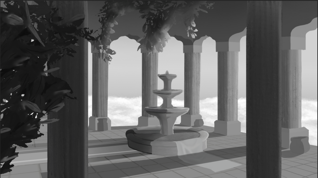
I worked on adding the clouds in the background, using references to determine how shadows fall between clouds. After that, I did some draw-overs and got feedback on what I could add to my piece. I fixed the direction of the shadow of the fountain, added a rug and some pots to fill the scene, darkened/brightened respective values, added occlusion shadows to the pots, and defined the archways. I also added some basic lighting to the plants I had previously added.
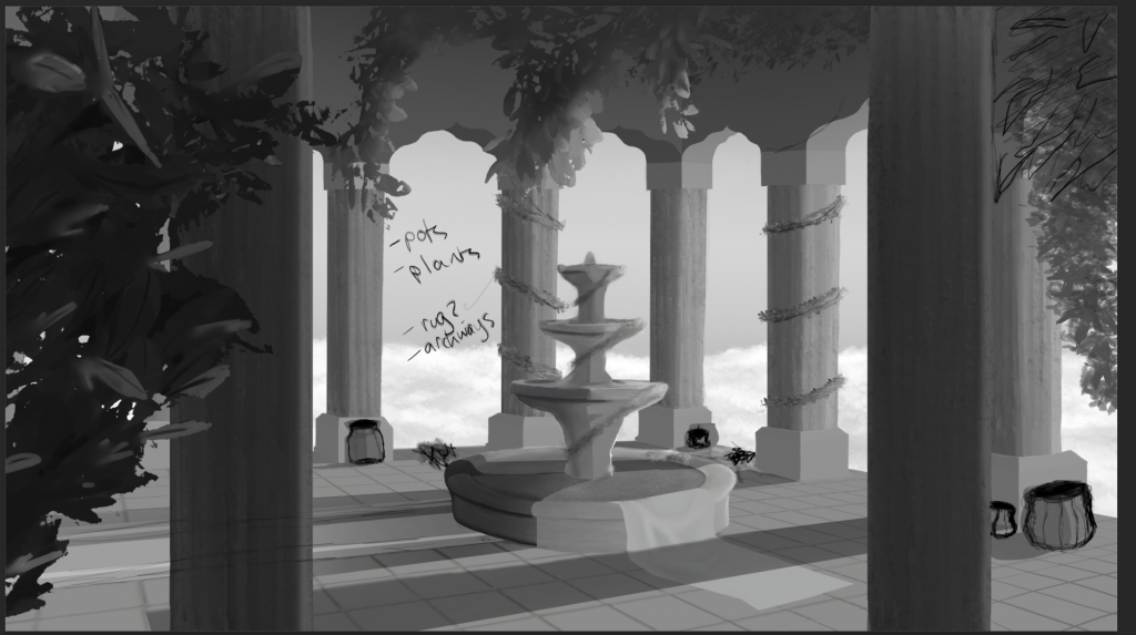
The draw-over I did before adding the previously mentioned objects into the scene.

To finish off the piece, I photo-bashed some textures onto the pillars. I made it very subtle so that it would still work in harmony with the rest of the piece. I then added an extensive amount of foliage around the scene to fill in spaces and decorate the objects, while not making it too overcrowded. I am satisfied with this as my final iteration of the piece, and will move onto adding colour.

To colour in the piece, I utilised colour and soft light layers. I chose to do a warm peach colour for the pillars and the fountain because I wanted to emphasise the warmth and time of day that the piece is set in, which is just before sunset/bordering sunset. I put on flat colours since the values had already been drawn through grayscale, but wherever I felt I needed to edit it, I used other colours. I made the foliage a yellower green to make it match the warmth of the pillars and the floor. I made the water a light blue colour with a hint of red because it added a subtle dreaminess. I found that the darker values on the pillars were not standing out well, so I used multiply layers and a darker orange to deepen the shadows. For the cast shadows, a peer recommended to use a dark blue shade rather than grey/black to avoid muddiness, and so I changed the shade of the shadows to a very dark blue and it made the scene feel cleaner and more realistic. Throughout the colouring process, I would flip the canvas a lot so that I could look at it with fresh eyes. It was because of this that I realised I had not added any rim lights. I added rim lights to the objects directly facing the sun by using add layers to make the edges glow, and a peer suggested I add an orange transition shade between the light and the objects, so I added it and it made it feel much more natural.

I duplicated all the layers and combined them into one, and experimented with the levels of the piece, and tested out making it darker. I liked this when I first saw it because darkening everything made the piece feel more dramatic, however looking at it again, later, I felt that it made certain objects too sharp.

I experimented more with the levels, and was able to make the piece feel more dramatic and darker without making it feel too sharp. I think that this final iteration accurately portrays the time of day, and is the perfect amount of dramatic. The composition of the piece also ended up working out well, with no area of the piece feeling too empty.
Overall, with this 2D assignment, I was able to learn a lot about 2D, including the iterative process of designing a composition of a piece, doing studies on references, blocking in, lighting, and more generally the entire process of creating environment art from start to finish. I have so much I could improve on, such as my knowledge on lighting and perspective, and in the piece there is more I could add and refine, such as the foliage being more developed, adding flowers or different types rather than only bushes and vines. I could also have developed the wall more, or made my shadows more detailed. However, despite all of this, I am extremely happy with the outcome of this piece. With this being my first 2D piece, I had no idea what the outcome would be like, but I feel like all the knowledge I have gained has made me much more confident in 2D and I have enjoyed this entire assignment.
Leave a Reply